


All-day events are the closest thing Google Calendar offers to a project phase, and the most underused shape in the product. They span days, they sit above the day grid instead of competing with it, and they cost nothing to adopt. Here is how to use them properly, and where they run out.
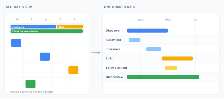
A timed event answers when something happens. A phase answers how long something is going on, which is a different shape of question and a different shape on screen.
Creating an event with the all-day box ticked and stretching it across the days a phase covers produces a bar in the strip at the top of the day and week views. Discovery runs Monday to Wednesday, the build picks up Thursday, a client review window runs across the whole week underneath both. The meetings inside those phases carry on living in the grid below, undisturbed.
Making them readable
A few conventions carry most of the value.
- Name a phase as a noun phrase, not a task. Client review window reads correctly at a glance; Send designs to client is a timed event pretending to be a phase.
- Keep phases on the calendar the work already lives on. A separate calendar just for phases looks tidy and quietly becomes a second copy of the plan, shared with a different set of people and drifting from the first.
- Keep them few. The strip grows downward and pushes the day grid with it, so a dozen overlapping phases will cost more legibility than they buy.
The strip hands over
A phase drawn this way is a label over a span, and nothing more. It does not contain the meetings that fall inside it, so dragging the phase leaves every one of them where it was. It holds no relationship to the phase after it, so extending discovery by two days does not shift the build.
The strip is also only good for a week at a time. Switch to the month view and the phase becomes an ordinary long event, chopped up across the rows. Of the six views that come as standard, the one that shows phases best shows five days of them.
That is the gap scheduling practice cares about. NASA's Schedule Management Handbook treats the boundary between one phase and the next as an interface point: somewhere work is passed on, and somewhere a milestone belongs.
Milestones should be tied to or represent a specific product or event and should have clear, objective (quantifiable) criteria for measuring accomplishment.
NASA Schedule Management Handbook
A phase in the all-day strip records none of that. Nothing before it, nothing after it, and no test for whether it actually finished.
Which is the honest summary: all-day events give a project the right shape at the wrong scale.
The same phases, at project scale
Ganttify puts phases and the meetings inside them on one axis that spans the whole project rather than one week of it. An all-day event stretching three weeks is a bar three weeks long, beside the timed events it overlaps, with no wrapping and no strip to run out of room.
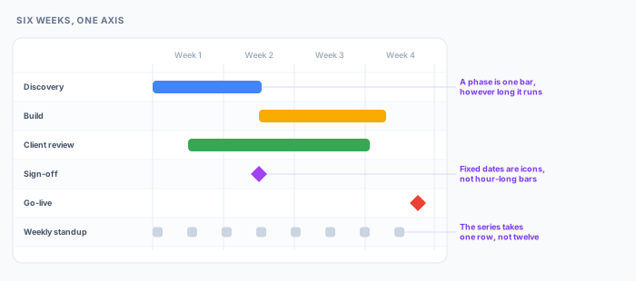
Recurring meetings collapse into a single row for the series instead of one row per occurrence, so a weekly standup costs the chart one line rather than twelve. Dependency lines join a phase to whatever waits on it, so extending discovery moves the build rather than requiring you to remember that it should.
Phases also stop competing for room. Each takes a color you choose, and a group created on the chart can hold a phase together with the meetings that belong to it, collapsing to one line when the detail is not the question. Groups exist only in Ganttify, so none of this reshapes the calendar the rest of the team is working from.
The other half of the shape problem is the opposite case. Some things in a plan are not spans at all: the sign-off, the go-live, the date the client was promised. Those convert to a single moment carrying an icon you pick, which is what stops a deadline from being drawn as an hour-long bar that reads like a meeting.
Dragging a phase writes the new dates back to Google Calendar, which keeps the calendar as the record and the chart as the view of it.
Trying it
The Google Calendar integration is in invite-only beta as this is written. Join the waiting list and we'll send an invite as we widen access.