



A month view and a Gantt chart both draw time as a grid, which is why a screenshot of one is often mistaken for the other. The difference is not decorative. It is what a row is allowed to mean, and it shows up the moment a piece of work outlives a single week.
The row is the whole difference
In a month view a row is a week. Everything inside it is one of seven days, and an event's vertical position is an artifact of which day it starts on. Two blocks sitting on the same line share nothing except a calendar week.
In a Gantt chart a row is a piece of work. It belongs to that work for the entire width of the chart, whether the work lasts a day or a quarter, and its vertical position is a fact about ownership or grouping rather than about the date it happens to begin.
Every other difference follows from that one.
Work that outlives the week
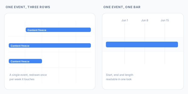
A month grid is built out of week rows. A seventeen-day content freeze therefore cannot be drawn as a single shape, because no single shape in that layout is seventeen days wide. It is drawn once in each week row it touches.
Reading its length means finding three segments, confirming they are the same event, and adding them up. Reading its length on a timeline means looking at a bar.
For a standing meeting this costs nothing, which is why it goes unnoticed for years. For a phase of a project it is the number people are asking about.
Nothing records what waits on what
A month view can put two events side by side. What it does not set out to record is that the second one waits on the first. An event holds its time, its guests and its reminders, which is what a calendar is for, so moving the first leaves the second exactly where it was.
A Gantt chart treats that relationship as data. Two blocks joined by a dependency stay joined when either one moves, which turns rescheduling from an exercise in memory into a redraw.
This is the difference that scheduling practice actually tests for. NASA's Schedule Management Handbook, writing about schedules that record the dates without the work leading up to them, is blunt about where that ends up.
Many times milestones are slipped at the last minute because the actual progress toward milestone completion is not reflected in a clear and obvious manner, and unfortunately, not adequately addressed until it is too late to recover.
NASA Schedule Management Handbook
A month view is a clear and obvious record of when things are meant to happen. What it does not carry is whether the work feeding them is still on course, because nothing in it ties one piece to the next. The date holds until the day it does not.
A month view has no hand-offs to inspect. It is not a worse schedule than a Gantt chart so much as a different kind of object, one that records when things happen and never why they happen in that order.
Six views, none of them your project
Google Calendar ships six views: Day, Week, Month, Year, Schedule, or 4 days. Each is a fixed window, chosen before the content is known.
A project rarely fits one of them. Six weeks straddles two months, so the month view shows it in halves and the week view shows it in sixths. A Gantt chart scales its axis to the work instead, which is a small thing that removes a lot of scrolling.
Four things the timeline layer adds
The events themselves are unchanged. What changes is how much they are allowed to carry.
- Dependency lines. Drawn between blocks, and enforced. Move the review and everything downstream of it moves, which is what lets the two of them together forecast a finish date.
- Color you choose. Blocks take a color per piece of work rather than inheriting one from whichever calendar the event happens to live on, so a phase, a risk and a fixed deadline can look different at a glance.
- Milestones instead of thin bars. An event with a start and an end can be converted to a single moment and given an icon you choose, so a launch date or a client sign-off reads as a point on the plan rather than a sliver of a bar nobody notices.
- Groups that exist only on the chart. Create a group, drag events into it from any calendar, collapse it when you want the shape of the plan instead of its detail. None of it is written back to Google, so grouping for planning never means reorganising anyone's calendar.
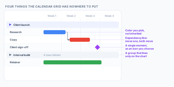
That last one matters more than it sounds. A calendar can only group by calendar, and calendars are shared objects with other people's expectations attached. A chart-only group is a planning structure nobody else has to agree to.
Keep both open
The month view wins at answering what is happening on a given day. It is the better tool for availability, for standing commitments, and for anything where the question starts with a date.
The timeline wins when the question starts with a piece of work: how long it runs, what it holds up, and what moves when it slips.
Those are genuinely different questions, which is what makes choosing between the two a false choice. Ganttify builds the timeline out of the Google Calendar you already keep, and writes changes back to it. The month view carries on answering the first question. The chart answers the second, from the same events.
Trying it
The Google Calendar integration is in invite-only beta as this is written. Join the waiting list and we'll send an invite as we widen access.